The wordmark
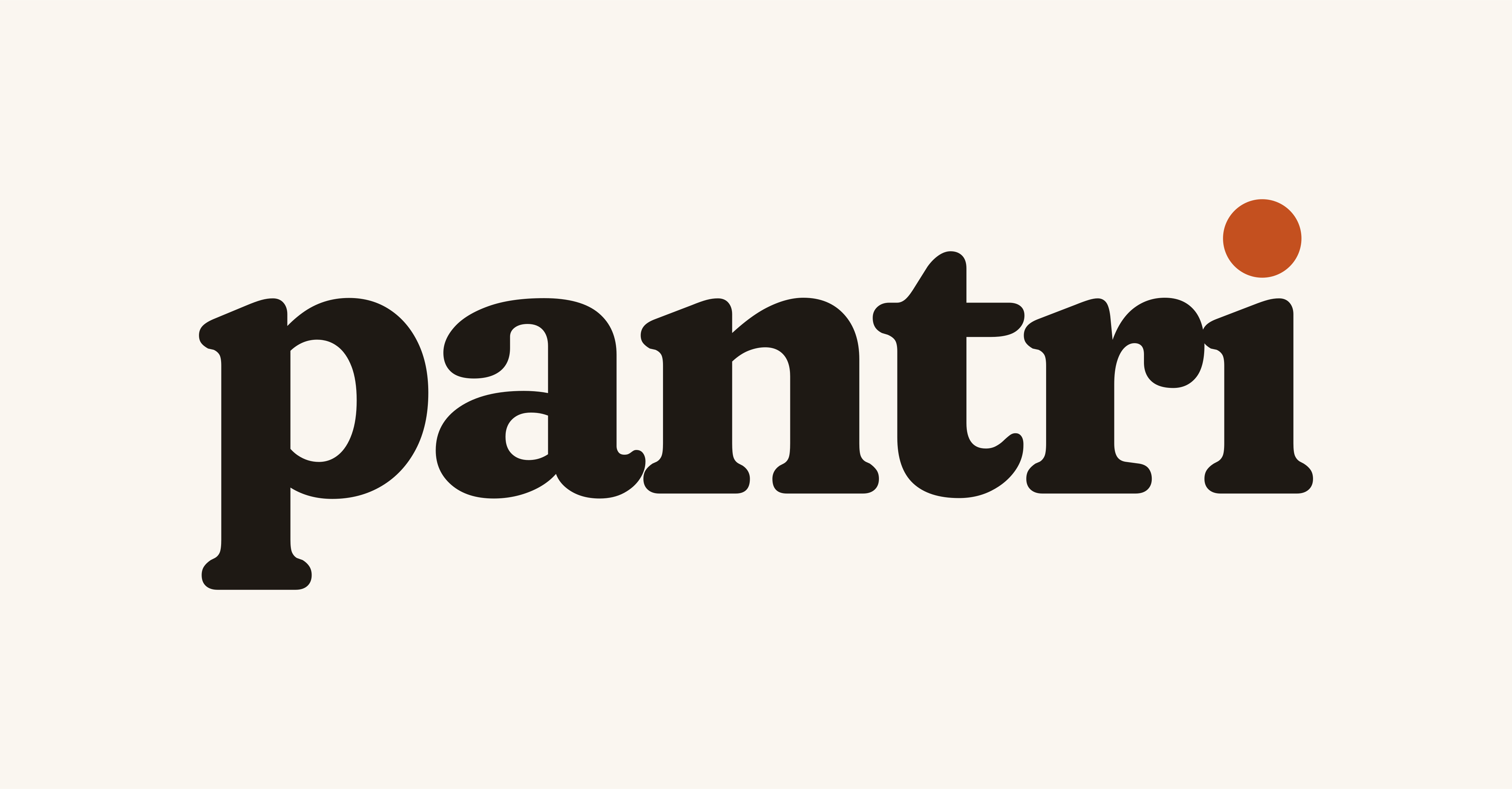
A lowercase pantri in Fraunces, with a round clay seed for the dot of the i. It carries over the orange full stop from the old landing wordmark, and puts it where it belongs.
pantri, with the seed

- Typeface
- Fraunces 700, optical size 72, SOFT 100, WONK 0. Converted to outlines, so it never depends on a font being installed.
- Tracking
- −0.035em, tighter than the font’s default so the word reads as one shape.
- The seed
- A dotless i with a Clay (#C4501F) circle, 0.19em across, sitting 0.05em above the stem. Slightly larger than the font’s own dot, and perfectly round.
- Never retype
- Always place the SVG. Typing “pantri” in Fraunces gives the wrong dot, tracking and spacing.
How it is built
Construction. Lowercase letters sit on the baseline and share one x-height. The seed is the only colour.
One x-height on every side
Clear space = x. Keep at least the height of the lowercase x clear on all four sides. Nothing else (text, edges, other logos) enters the shaded area.
Downloadable versions with the clear space built in: on Paper and on Cocoa.
Small, but never too small
- App header
- 26px tall, which is 74px wide. Anything shorter drops below the 72px minimum.
- Landing header
- 30px tall on phones, 34px on desktop.
- Email header
- 120px wide.
On every Hearth surface



Do
Use the primary version on Paper, Raised and Sunken, and the reversed version on Cocoa and in dark mode.
Don’t
Put the wordmark on photography, illustration, Saffron or Sage. Photos get the app icon or nothing.
A paper p on a clay square



- iOS
- Supply the full-bleed square (
pantri-app-icon-square, 1024px). iOS applies its own mask. - Android / PWA
- 192px and 512px rounded icons, plus a 512px maskable icon whose p sits inside the 80% safe zone.
- Social avatar
- The 1024px square. Platforms crop to a circle; the p stays clear.
The smallest Pantri
Pantri · Plan this weekfavicon.svg for modern browsers, favicon.ico (16, 32, 48) as fallback, apple-touch-icon.png at 180px.<link rel="icon" href="/favicon.ico" sizes="48x48"> <link rel="icon" href="/favicon.svg" type="image/svg+xml"> <link rel="apple-touch-icon" href="/apple-touch-icon.png"> <link rel="manifest" href="/site.webmanifest">
Please don’t
Pantri.
Don’t retype it, capitalise it or add a full stop.Don’t stretch or squash it.
Don’t set the letters in Clay or Action.
Don’t recolour the seed. It is Clay, or the single logo colour.
Don’t add shadows, glows, outlines or gradients.
Don’t place it on a retailer colour or anything that suggests a partnership.
Don’t rotate it or set it on a path.
Smart AI planner
Don’t lock it up with badges, taglines or banned words.